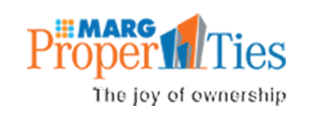
The Logo
Conveying the name in a subtle fashion – Proper Ties, with all the concerned characteristics – Customers, Associates… fostering, Nurturing relationships & Long term associations.
The thought behind the logo.
Font:
Strong & Structured – reflecting the product category.
Imagery:
Abstracted use of buildings to signify product category with above eye level perspective to suggest soaring high rises. The ‘PROPER” & ‘TIES” connected with use of colors borrowed from the mother brand MARG.
Colors:
- Orange – Flamboyant and Energetic
- Orange is vibrant. It denotes energy, warmth, and the sun
- Grey is a neutral, balanced color. It is a cool and conservative color
- Blue is seen as trustworthy, dependable and committed. It is calm and sedate.

